
First things first – what is transitional design, you may ask? For those who are fans of interior designs that are a bit classic and contemporary all at once, then you are likely a fan of this popular interior trend without even knowing about it. According to Los Angeles interior designer Stefani Stein, “Transitional design is about blending a traditional aesthetic with modernist sensibilities, allowing the two styles to combine effortlessly is about balance.
Balance and effortlessness are the operative words here. Transitional spaces tend to focus on comfort. As such, their typical palette is usually neutral and light to make sure there is not much tension between the contrasting styles. The result is that the area looks sophisticated and fresh at the same time and gives off a relaxed atmosphere. “This style feels personalised, comfortable and has the innate flexibility to evolve with residing families,” states Hannah Yeo, Manager of Colour Marketing and Development at paint brand Benjamin Moore. She continues, “In some ways, transitional style allows homeowners to create their own style and accommodate individual needs, making this style ideal for a room where families gather. And because it has the power to stay current, this style will not go out of style for the foreseeable future.”
For those looking to try out this adaptable and timeless style in your own living rooms, here are a few popular and stylish colour palettes to help you get started with designing!
Pale blue and beige with gold accents
Beige and pale blue tends to be a calming combination to the mind, as it helps to remind us of nature and days spent near water or on the beach. The addition of gold accents can help make the room feel luxurious and contemporary as well. Hannah Yeo explains that soothing blues tend to make a great backdrop if you are looking to create a relaxing and classical living room. Additionally, these hues also have some grey undertones that can make them easy to decorate and live with.
When in doubt, most experts agree that you should go for a neutral hue. This is because any new piece you add, whether a new piece of furniture or accessory, will fit right in instead of clashing. Furthermore, these soft neutral hues can have a stately traditional look and can also take on a modern appearance by pairing them with other bold colours and accents.
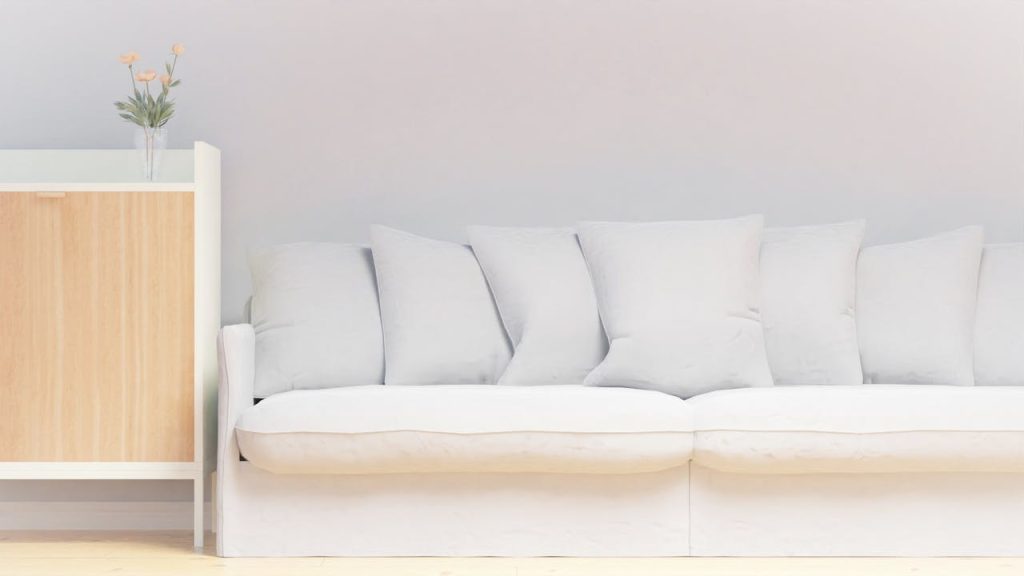
Grey, white, with black and brown leather
Again, if you want to stay safe when it comes to designing a comfortable transitional living room space, you can opt to keep your palette entirely neutral. These neutral palettes help to bring out the more traditional elements in certain furniture pieces, such as rugs, sofas and the cabinetry. Some interior designers believe that doing so can create a strong colour scheme that can be used as a base palette for any other colour or patterns that may be added later in.
Grey, White and Yellow
If you are looking to include bolder colours in your transitional living room palette, then how about considering using yellow instead? Surprisingly enough, yellow – or rather pale yellow – is one of the best colours to go with grey and can be blended well in a transitional living space. According to some interior designers, yellow is a great colour to use with neutral colours because it is so close in tone, allowing it to blend in effortlessly. Additionally, yellow, while still being soft, can be an accent in the room to make certain things stand out.
Green, purple, cream and charcoal
You can also create a sense of balance in your living room space by using contrast. In this case, you may decide upon using contrasting colours, such as purple and green. This is because these two colours harmonise with each other overall. For instance, the deep charcoal to almost black hues has a kind of traditional weight to them. So these dark colours are great to highlight certain architectural details such as window mullions, French door frames, or staircase spindles, to name a few. That being said, it also takes on a more fresh and modern look when paired with crisp whites, which creates a high level of contrast.
Lavender brown, beige and wood
Natural wood and certain plaster finishes may end up behaving like neutral tones to help you balance out your transitional living room. They are also great colours to go with lavender – another tone that is trending recently.
This is because these colours together can help bring a sense of intimacy, warmth, and history to a space. As most experts say, the great thing about using a transitional style for the living room is that it is very open and flexible to personal taste. It can let people reconcile different types of eras, materials and furniture into one single space. The combination of old and new, especially in this colour palette, helps to create a completely fresh and new environment.